Project Description
Project Description

BACKGROUND
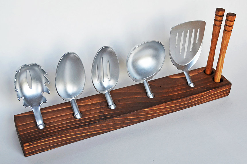
In many kitchens, there is a drawer or cabinet that is dedicated solely to kitchen utensils, such as ladles, spoons, and whisks. This drawer or cabinet can quickly become cluttered as the utensil collection grows, making it difficult to locate the utensils one is in search of. Palate, a modular kitchen gadget set, addresses this very issue. It is a kitchen gadget set with interchangeable pieces that attach to one universal handle, reducing the amount of space taken by kitchen utensils. The set comes with a wooden stand that the pieces are placed in, making the set accessible and organized.
This project was created as a concept for future product development, as the time and resources were limited. The project was an individual assignment for a 3D design class at Western Washington University, which students were given about two weeks to complete. We were asked to develop a product idea that differs from any product that currently exists, and to create packaging for it that complements the aesthetics and functionality of the product. As this was an individual assignment, I was responsible for all aspects of the project, including conceptualizing and building the product, developing the branding, and designing and building the packaging for the product.
TASK
When assigned this project, each student was asked to develop a sentence summarizing a purpose for their product, and to create a product based on that purpose. I chose to create a product that improves a daily task in the home. By examining my own kitchen, and considering struggles that others face in their own kitchens, I concluded that kitchen utensil drawers can become quite cluttered and difficult to search through once a substantial amount of utensils is collected. Based on this conclusion, I developed a product concept that addresses these issues.
CONCEPT
To address the issues of clutter and space consumption in kitchen utensil drawers, I developed the idea of an interchangeable kitchen utensil set, which has a number of attachments for different purposes. The set comes with pieces such as a serving spoon and ladle piece, and has two universal handles that fit all the pieces. The set comes with a stand that holds all the pieces neatly, which can be placed on a counter top, nailed to a wall, or placed inside a drawer or cabinet. My approach to this project was to not only create a product that was practical and accessible, but also elegant and simple, and something consumers would want to display on their counter top as a nice aesthetic.
PROCESS
In order to design and develop the product prototype, a substantial amount of brainstorming and research were required to find the most functional and practical way to design it. Brainstorming involved taking notes on the most important features that the product should have, such as functional features and kitchen utensil pieces that should be included. The brainstorming process also involved a large amount of sketching and note-taking on features that should be a part of the form. For example, I concluded that the product should have pieces that can be quick released with a button for ease of use, and should have handles that are ergonomic. The project also involved brainstorming brand names and important aesthetic characteristics that fit the product’s purpose and the audience it is intended for.
Before brainstorming, research had to be conducted so conclusions could be drawn about important characteristics that the product should have. Research involved studying competitor products with similar features, creating mood boards that represented important visual characteristics, and learning about characteristics that the target audience desires in kitchen products. In defining the key characteristics of the product, I was able to conclude that the target audience would be individuals who want to save space in their kitchen, and want to make cooking more simple and practical. This would most likely be individuals who have been cooking for a number of years (30 years and older) and would like a more simple and enjoyable cooking experience. These individuals like to invest in products that simplify their lives, and feel that elegance and great user experiences are important in choosing products.
In the process of choosing a final concept to implement, I explored a variety of ideas before coming to the final concept. The concepts I explored included a variety of handle shapes, pieces to include, and ways to attach the pieces to the handles. I also explored different ways that the pieces could be stored and organized. I considered a wooden box that holds all the pieces, and a wheel that spins on a counter top for easily accessing the pieces. Ultimately, a sleek wooden stand was the final concept I chose, because not only is it accessible and well organized, but it’s simple and elegant design is most appropriate for placing on a counter top or somewhere visible in the kitchen. As far as the way that the pieces attach, a quick release button at the bottom of the handles seemed most logical because it makes the pieces easily attachable and detachable for users. Once I established my final concept, I explored a variety of visual design elements, including materials to use, colors for packaging, and ways to brand the product. For the handles, I explored different types of wood, plastic, and metal before deciding to use a light and sturdy wood material. For the interchangeable pieces, I also explored wood, metal, and plastic, but concluded that metal would be most durable and elegant.
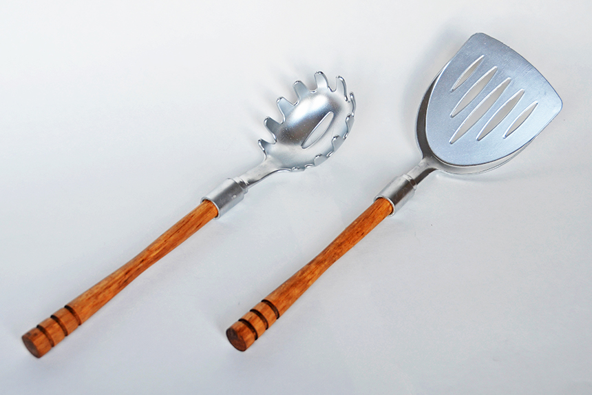
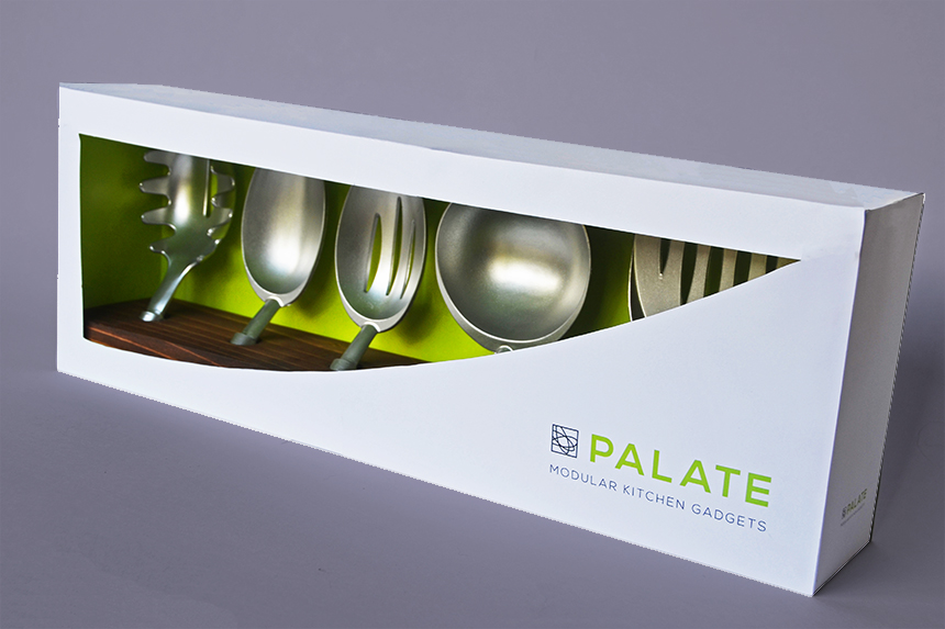
Although the prototype I built doesn’t have all the materials that would be most ideal (due to cost, access to materials, and shortage of time), the final product would have teak wooden handles, matte stainless steel kitchen utensil pieces, and a mahogany wooden stand. In constructing my prototype, I made sure to give the prototype the appearance of being made of the ideal materials so viewers could easily envision the final product. The product itself is simple and sophisticated, so I wanted to make sure that the packaging reflected that simplicity. The final packaging uses a lot of white space, an apple green accent color, and incorporates a minimalist contemporary logo with a sans serif typeface. The front of the package has a large die cut window to reveal the product, letting the product speak for itself at point of purchase. Overall, the visual design elements of the product are contemporary, minimalist, and upscale.
In order to implement the final prototype, a lot of careful planning and measuring had to be done to ensure that the product was precise and aesthetically pleasing. The wooden stand was cut from a 2” by 4” piece of board, had holes drilled for the product pieces to fit into, and finally was sanded and stained to give it the appearance of smooth walnut wood. The head pieces were cut from plastic kitchen utensils and painted with matte silver paint to reflect the appearance of matte stainless steel. The handles were cut from kitchen utensils, sanded, and stained to give the appearance of teak wood. Mock buttons were placed at the ends of the handles to imitate the quick release buttons that the final product would have. Attachment pieces were placed on the handles and head pieces so the handles and pieces can attach, giving users a feel for what the final product would be like. The packaging was printed on matte cardstock paper, although the final packaging would ideally be constructed with boxboard. Overall, the prototype successfully represents the final product and its key visual elements.
OUTCOME
The final prototype for this project reflects the materials and visual elements that are key components for development of the final product. The biggest challenge faced in completing this project was being able to develop a product idea, create a visual language, and implement a prototype in the short time frame given. Although there wasn’t enough time allotted to locate and use the desired materials for the prototype, it clearly demonstrates to viewers what the function and aesthetics of the final product would be. In completing this project, I discovered that one of the most important aspects of a design prototype is to build it so it demonstrates the key functions and visual elements that the final product should have. Along with an effective prototype, one must be able to articulate key characteristics of the product so others can easily envision the final product.
Project Details
Class:
3D Graphic Design
Skills:
Product and Packaging Design

